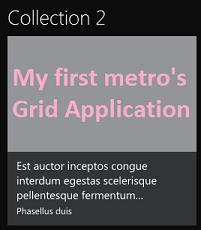
 Windows 8 is here and Visual Studio 2011 comes with it hand in hand.
As you may already have read/seen/watch, there is a new set of applications coming named as ‘metro’.
Visual Studio 2011 then comes with templates for different types of applications: basic Application, Grid Application and Split Application. Each one helps you create application for windows 8 with the metro style.
In this post we are going to explore in details a first type of application template: the Grid Application.
What is a Grid application ?
A grid application, as the template says, is “a multi page project for navigating multiple layers of content with item details details displayed on dedicated page“.
Actually, it looks like a composition of Windows Phone pivot and panorama. There is three level(the layers..) in the application. The first one display a list of the available collections. Think of it as groups. There is a scrollbar at the bottom which indicate that it the data does not fit, you can scroll inside.
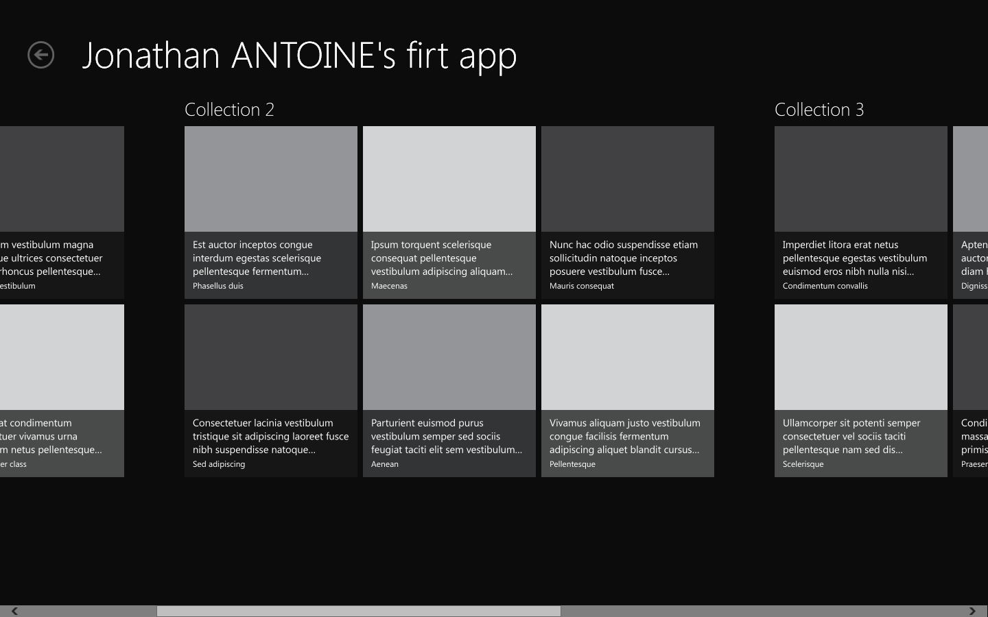
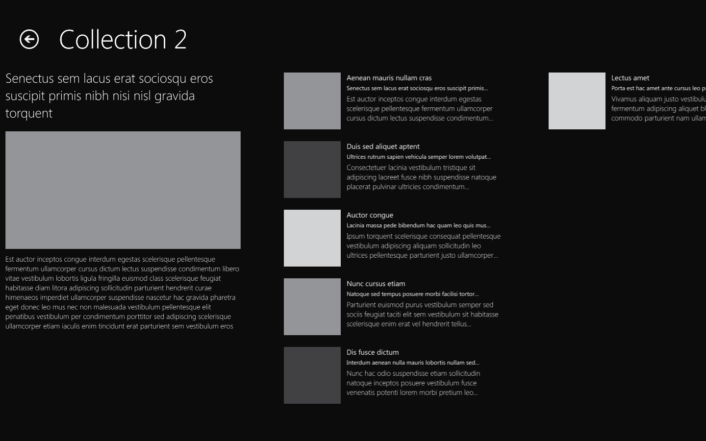
Then when you ‘touch’ (oups, I forgot to use the ‘click’ term 🙂 ) on a collection name, you drill down into the collection details. Notice that touching an item make the app goes directly to the item details.
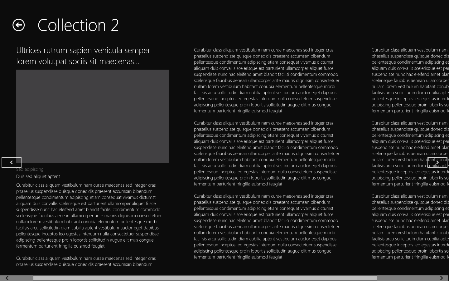
Finally when you are on the collection details, you can click on an item and go to its details. Notice the button at the left and the right which enable navigation trough items.
EDIT:
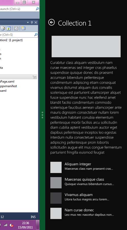
I forgot yesterday to point out that this application has a different UI when it’s used in “splitted mode”. This is a really nice feature and here is the screenshot:
Let’s create one !
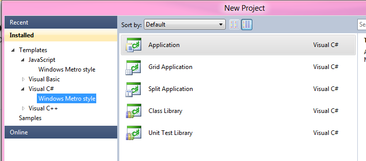
To create an application, you can use the Visual Studio usual wizard and select the grid application template:
Then you have the following screen in front of you:
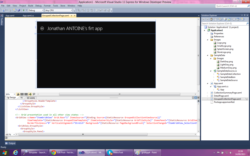
It’s time to pay attention to certains things:
- There is no reference in this project !
- The productivity power tools is here by default in Visual studio !
- There is a lot of files and not only the traditional App.Xaml and MainWindows.xaml !
The first bullet is easy to explain: just open the project file with an XML editor and you will find the following little comment line.

What are the default files ?
There is a lot of files by default:
- App.xaml: this files contains a lot of resources used by the application. Fonts, brushes, controls’ styles, controls’ template and even the application name is inside.
- CollectionSummaryPage.xaml: this is the page which display the details/summary of a collection.
- DetailPage.xaml: this is the page which display the details of an item.
- GroupedCollectionPage.xaml:this is the start page which display the collections.
- Package.appxmanifest: this file defines how the application will be displayed in the market place. It looks a lot like a windows phone manifest file but with a nicer editor.
How the navigation is handled ?
Did you noticed that I used the word ‘page’ and not ‘Window’? This is because there is only one window which display the pages.
The pages are actually UserControl(declared in the Windows.UI.Xaml.Controls namespace…) which are set as Content of this unique Windows. One funny thing is that there are declared as partial classes but the base class is only declared on the ‘generated’ class matching the ‘XAML’ one:

The App class exposes static methods which are called from the pages to navigate to the other pages. Here is an example of one of them:
[csharp] public static void ShowGroupedCollection()
{
var page = new GroupedCollectionPage();
if (_sampleData == null) _sampleData = new SampleDataSource(page.BaseUri);
page.Groups = _sampleData.GroupedCollections;
Window.Current.Content = page;
}
[/csharp]
From where does the data come from ?
I though that the classic design data generation from blend will be used but to my great astonishment, the data displayed by default is ‘hand made’. There is one class named ‘SampleDataSource’ which is (as you can see in the previous snippet) created when you navigate to each page. In the constructor of this class, each item is created with a line of code.
If you want to use your own collections and items, this is easy: create the data objects and put them inside the properties of the pages. As an example of what is done on every pages, the GroupedCollectionPage (displaying the collections), exposes a ‘Group’ property. The setter of this property will use the value as a source of a CollectionViewSource in the resources of the page:
[csharp]private IEnumerable<Object> _groups;
public IEnumerable<Object> Groups
{
get { return this._groups; }
set
{
this._groups = value;
GroupedCollectionViewSource.Source = value;
}
}
[/csharp]
And about the animations ?
As you can’t see there is a some animations when you navigate from one page to another. I won’t go in details here because this is pretty classic stuff done by using the Visual states so one one is going to be surprised here 🙂
EDIT: you may find interesting that the splitted mode of the app is also one Visual state.
What more to say ?
This application template is quite complex for a start but it is greatly done.
I think that it can be difficult to use for beginners because there is a lot of things which are not as easy as it can seems: CollectionViewSource, resources resolutions, visual states, etc… But this is really nice for someone who knows these things 🙂
The code, XAML or C# is well commented and there is explanation on every important lines which make it easy to understand.
Finally, you can see that this is only a preview by the number of work around and temporary things you can find. The search windows finds 5 ‘temporary’ and 5 ‘workaround’ in this template for me !


.jpg)
15/04/2012 14 h 07 min
Is there any similar Windows 8 Grid Metro Application for 7 or Vista? Thanks
15/04/2012 14 h 17 min
No this is a bright new class of app only available on win 8. Thx for visiting my blog !
14/05/2012 21 h 10 min
Congratulations. Very good entry!
12/07/2012 1 h 48 min
Hi. How can you dynamically populate the grid with pictures from a local folder?