We wil do this using DirectX and Unity.
As you can see in this video, the “context” of the leaved Windows is kept : the scroll position does not change.
Opening another Windows from a n UWP app
Since a long time now, you can open a new Windows from a Windows Store app (UWP or Universal). For instance, the Mail app does this to let you edit an email in another dedicated window.
To perform this, you have to ask the SDK to create a new View (CoreApplicationView) which maps to a Window (CoreWindow) and an associated Dispatcher. This last point is interesting because you have to be very careful, when you share your ViewModels between windows, to be on the good Dispatcher when raising INotifyPropertyChanged event or doing some UI-related work.
Here is the code to create a Window :
// récupération de l'id courant pour usage ultérieur
var appViewId = ApplicationView.GetForCurrentView().Id;

//Create a new view \o/
CoreApplicationView newCoreAppView = CoreApplication.CreateNewView();

await newCoreAppView.Dispatcher.RunAsync(
    Windows.UI.Core.CoreDispatcherPriority.Low,
     () =>
     {
         //Get the created Windows
         Window window = Window.Current;
         ApplicationView newAppView = ApplicationView.GetForCurrentView();

         // create a new frame and navigate to the page
         var secondFrame = new Frame();
         window.Content = secondFrame;
         secondFrame.Navigate(typeof(MainPage));

         // activate the new Window
         window.Activate();

         // make the new window standalone
         ApplicationViewSwitcher.TryShowAsStandaloneAsync(newAppView.Id,
             ViewSizePreference.UseMore, appViewId, ViewSizePreference.Default);
     });
By providing no argument to the CreateNewView method, we ask the XAML framework to create and manage a XAML UI.
We could also provide an argument of type IFrameworkViewSource to be able to have our own Window managed by our code. This is what DirectX does and it will let us create holograms !
Displaying a 3D DirectX view from the 2D view
By using the “HolographicDirectXApp” Visual Studio sample, I have all I need to create and display a 3D rotating cube by. The generated code creates an instance of IFrameworkView using DirectX. The sample use SharpDX, some C# classes and shaders that I can simply copy/Paste directly in a new XAML UWP project.

I then only have to use the previous snippet and ask it to use the DirectX AppView.
I have to carefully :
- keep an instance of my AppViewSource : if it’s garbage collected, my 3D view will disappear.
- Activate the created Window for the DirectX view.
Of course, as all 3D holographic view, my start screen and the 2D View will disappear to let only the 3D objects in my space.

Displaying a 3D Unity view from the 2D view
An Unity app being an UWP app the code to write will be very similar. We will only have to customize the generated Unity code to stay in a 2D World instead of going directly to the 3D exclusive View.
To be in the right configuration, I generate a XAML project instead of a Direct3D player in Unity. I then have this :
- Unity initialization is done in the App class.
- A MainPage XAML app which finish the initialisation and is the first page navigated to.
To have a “standard” Xaml project, I then perform these modifications :
- I create a XAML “BlankPage” named StartupPage.
- I navigate to this page instead of MainPAge. I then stay in a 2D classic XAML context and I can build my application around it.
- I move the use of the AppCallbacks class from the App.cs class to the existing MainPage.
The next steps are easy : I create a new Window, add a frame in it and navigate to the MainPage. I use exactly the same snippet as before and I only have to register an event handler to the activation of the created Window to be able to initialize Unity then. I also store the main view’s Id for further use.
private async Task CreateNewHoloWindowAsync()
{
    var appViewId = MainAppViewId = ApplicationView.GetForCurrentView().Id;

    var _newCoreAppView = CoreApplication.CreateNewView();

    await _newCoreAppView.Dispatcher
        .RunAsync(CoreDispatcherPriority.Low,
      async () =>
      {
          var frame = new Frame();
          Window.Current.Content = frame;
          frame.Navigate(typeof(MainPage));

          var res = await ApplicationViewSwitcher.TryShowAsStandaloneAsync(
              ApplicationView.GetForCurrentView().Id,
              ViewSizePreference.Default, appViewId,
              ViewSizePreference.Default);

          _newCoreAppView.CoreWindow.Activated += WindowActivated;

          _newCoreAppView.CoreWindow.Activate();
      });
}

private void WindowActivated(object sender, WindowActivatedEventArgs e)
{
    if (e.WindowActivationState == CoreWindowActivationState.CodeActivated
        || e.WindowActivationState == CoreWindowActivationState.PointerActivated)
    {
        AppCallbacks.Instance.SetInitialViewActive();
        // Only need to mark initial activation once so unregister ourself
        CoreWindow coreWindowSender = sender as CoreWindow;
        coreWindowSender.Activated -= WindowActivated;
    }
}
Going back to the 2D View
To go back to the 2D XAML view, you have to use the ApplicationViewSwitcher class and ask it to go switch back to the main Window.
I provide my Unity’s code an Action (GoBackToEarth.CloseThisHolographicView) it can call when needed.
// let's capture the dispatcher of the current view
var dispatcher = Dispatcher;

GoBackToEarth.CloseThisHolographicView = () =>
{
    // be sure to be on the Window's Dispatcher
    dispatcher.RunIdleAsync(async _ =>
    {
        // go back to the main Window
        await ApplicationViewSwitcher.SwitchAsync(StartupPage.MainAppViewId);

        // we close the 3D holographic Window
        Window.Current.Close();
    });
};
Happy coding !
]]>
- Download this project and add it to your solution : http://code.msdn.microsoft.com/wpapps/Language-Neutral-Resource-5894846e.
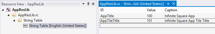
- Edit the string table in the AppResLib.rc file to set your app name, etc.
- Build this project and copy the resulting dll in your WP project. This will be the default values (neutral language)
- Change the values in the AppResLib.rc file for a specific language (for example french) and build again the project.
- Rename the resulting dll to AppResLib.dll.040c.mui and copy it at the root of the WP project, next to the dll. The “04OC” is specific to “French” and should be set to the value matching the target language. A full list is here : http://msdn.microsoft.com/en-us/goglobal/bb964664.aspx
- Do it again for as much language you want
- Select all the *.mui files and the AppResLib.dll file and set their build type to content in the properties Windows.
- Update your WMAppManifest.xml file and set the app name to this value : @AppResLib.dll,-100 . The value will then be taken for your file, depending of the user language, at the offset 100 in the string table.

Not really obvious but this works fine 
If you want to see this feature in action, it will soon be available in our last app “Say it With Flowers” !
PS: the whole procedure is describe in depth on MSDN but I am sure you love this recap
PS2: the localized app name won’t be displayed on the Store page because of a bug in the Store : http://blog.webrox.fr/?p=61
]]>This was good old times and these issues are gone in Windows 8.1 : youpi !
Let’s digg a little more 
The theme can be updated at runtime
Windows 8 theme resources are provided using StaticResource and so can’t be updated at runtime. The resources are loaded once at the app startup and even if you update it, the controls won’t update themselves because the StaticResource provide the value once and only once : when parsed.
Now comes a new markup extension named ThemeResource. You can use it like the StaticResource object but this special resource will update the targeted control if the Theme of the control is updated. You can see it as the DynamicResource in WPF but only for some “theme” resource and triggered only by a theme change.
Of course, all the template of the frameworks are now using this new feature and you are free (must ) use it in your own controls. You can actually use it anywhere in your XAML :
[xml]
<Border RequestedTheme="Light"
Background="{ThemeResource ApplicationPageBackgroundThemeBrush}">
</Border>
[/xml]
The theme can now be set by control
In Windows 8 you had to set the RequestedTheme property at launch (in the constructor of you app for example) and it could be set only once.
Now this is a property of the FrameworkElement class which is the base class for any control. The value will be inherited by all its children (this is actually done because it overrides values in the resource dictionary which will be available to the children of the control).
In this sample I override the theme twice in the same visual tree :
[xml]
<StackPanel RequestedTheme="Light"
Background="{ThemeResource ApplicationPageBackgroundThemeBrush}">
<TextBlock Text="Hello World !" />
<Border RequestedTheme="Dark"
Background="{ThemeResource ApplicationPageBackgroundThemeBrush}">
<TextBlock Text="Another theme" />
</Border>
</StackPanel>
[/xml]
It then produce this view :

Be aware that this is a “low priority” setting and that all the styles, directly set attributes/properties, triggers, animations and even implicit styles are winning over it.
Questions ?
- Can we set it by code ? : yes of course, this is a normal property.
- Can we use binding ? : Yes !
- What are the value of RequestedTheme for the children of a control ? : The value is “Default”. This only means that the value is not overriden and not that this use the App’s theme (it’s the theme of the first overriden parent which is used).
You can read this post in french too.
You can find more by exploring the “XAML requested theme sample (Windows 8.1)” of the samples pack provided by Microsoft.
Have a nice code
 Today, it’s a blog on a tip to use the values of an enum as the source of an ItemsControl (ListBox, ComboBox, ListView, etc.) and display them nicely using attributes.
We’ll provide a localized description to be displayed and the value will still be available to the binding.
In this post we’ll discover two very similar but differents solutions to this common issue.
[table-of-content]
Foundations
The foundation of the solution is based on reflection.
For a provided type, the RetrieveFromCacheOrAddIt method read the Display attributes and create a list of tuples from it. A cache is created so the reflection is done only once by type.
The first item (Item1) of the tuple is the real value and the second item (Item2) is the text to be displayed. If the attribute is not found, then the value of the enum is used as a description.
The display attribute can be found in the System.ComponentModel.DataAnnotations.dll assembly.
[csharp]
//The cache to use
private readonly Dictionary<Type, List<Tuple<Object, Object>>>
_cache = new Dictionary<Type, List<Tuple<Object, Object>>>();
//The method which fill the cache.
private object RetrieveFromCacheOrAddIt(Type type)
{
//if it is not already in cache
if (!this._cache.ContainsKey(type))
{
//get the fields of the type via reflection
var fields = type.GetFields().Where(field => field.IsLiteral);
var values = new List<Tuple<Object, Object>>();
foreach (var field in fields)
{
//retrieve the display attributes of the fields
var a = (DisplayAttribute[])field
.GetCustomAttributes(typeof(DisplayAttribute), false);
var valueOfField = field.GetValue(type);
//if there is a display attribute on the field.
if (a.Length > 0)
{
var newTuple1 =
new Tuple<Object, Object>(valueOfField, a[0].GetName());
values.Add(newTuple1);
}
//if not, use the value
else
{
var newTuple =
new Tuple<Object, Object>(valueOfField, valueOfField);
values.Add(newTuple);
}
}
this._cache[type] = values;
}
return this._cache[type];
}[/csharp]
Here is an example of an enum with the correct DisplayAttributes set:
[csharp] public enum MyEnum
{
[Display(Name = "My fist name to display")]
ValueOne,
[Display(Name = "My second name to display")]
ValueTwo,
[Display(Name = "My third name to display")]
ValueThird,
ValueFourWithNoDisplayAttribute
}[/csharp]
Use a converter
The first idea which comes in our WPF developer brain is to use a converter. This is easy to implement and pretty classic.
Here is the codeof the converter and the regarding XAML usage.
[csharp] public object Convert(object value, Type targetType,
object parameter, System.Globalization.CultureInfo culture)
{
var type = value as Type;
return type == null ? null : RetrieveFromCacheOrAddIt(type);
}[/csharp]
The converter is defined in a resource scope available to the binding and the Type of the enum is provided by setting the Source property of the binding to the target enum type using the x:Type markup extension. Here is an example:
[xml]
<DockPanel Margin="10">
<DockPanel.Resources>
<local:EnumToDictionnaryConverter x:Key="EnumToDictionnaryConverter" />
</DockPanel.Resources>
<TextBlock DockPanel.Dock="Left" Text="First solution : " FontWeight="Bold" />
<ComboBox DisplayMemberPath="Item2" SelectedValuePath="Item1"
SelectedValue="{Binding MyPropertyOnTheViewModel}"
ItemsSource="{Binding Source={x:Type local:MyEnum},
Converter={StaticResource EnumToDictionnaryConverter}}" />
</DockPanel>[/xml]
Use a markup extension
The second idea, really less verbose, is to create a markup extension. The type of the enum will be provided as a parameter.
Here is the code of the extension and the XAML usage of it below.
[csharp] public class EnumToDictionnaryExtension : MarkupExtension
{
public Type TargetEnum { get; set; }
public EnumToDictionnaryExtension(Type type) { TargetEnum = type; }
public override object ProvideValue(IServiceProvider serviceProvider)
{
var type = TargetEnum;
if (type == null) return null;
return RetrieveFromCacheOrAddIt(type);
}
//RetrieveFromCacheOrAddIt snippet from above !
}[/csharp]
DisplayMemberPath and SelectedValuePath still need to be set but there is no converter to define and unusual binding source to use.
[xml]
<ComboBox DisplayMemberPath="Item2" SelectedValuePath="Item1"
ItemsSource="{local:EnumToDictionnary {x:Type local:MyEnum}}" />[/xml]
Localisation – i18n
If you want to localize the used text, you can provide the type of a resource file to use.
The Display attribute GetName method will automatically pull the value from the resource file with the ‘name’ key of the attribute.
For example if I change the previous enum to the definition below, I will have to create a resource file (Localized.resx) and add values for the keys ‘Value1’, ‘Value2’ and ‘Value3’.
[csharp]public enum MyEnum
{
[Display(Name = "Value1", ResourceType = typeof(Localized))]
ValueOne,
[Display(Name = "Value2", ResourceType = typeof(Localized))]
ValueTwo,
[Display(Name = "Value3", ResourceType = typeof(Localized))]
ValueThird,
}[/csharp]
Then I can also create an another resource file named Localized.fr-FR.resx and translate the description in french.

If I set the culture of the UI thread to french, the values will be translated in it. Tada !
[csharp]Thread.CurrentThread.CurrentUICulture = CultureInfo.GetCultureInfo("fr-FR");[/csharp]

Demo
I created a little demo which you can find in my DropBox folder. It presents the two solutions. As you can see in the screenshot below, if no display attribute is set, the value of the enum is used:

[/table-of-content]
]]> Metro applications and windows 8 is designed to be runned on a PC. This is even better if this PC is a tablet (but an eeepc is too small)!
If the tablet has the required sensors, the application can detect its orientation and changes its layout to reflect it.
More over, the metro app can be used in fullscreen or in splitted mode. The last one is basically a way to run two metro applications side by side.
In this post we are going to see how we can detect this settings and follow their changes.
What is the splitted mode ?
The splitted mode displays two application side by side but each does not get the same aera to be displayed. One gets the four fith of the screen and the other gets only the last fith to be displayed. This enable scenario where you bring the main app in the main aera and a “note application” to in the small aera. What is interesting too is that the “small aera” stays displayed even if you changes the application in the main. This is as you were pinning an app.
In the screenshot below you can see visual studio in the main aera and the developped application in the small aera on the right. There is a green bar on the middle which you can drag to decide which application you want to be the ‘main’.

How to get the orientation and its changes ?
There is one class named DisplayProperties which exposes a static event named OrientationChanged. By subscribing this event you will be noticed of every change of orientation of the device. The current orientation is then available trough it’s CurrentOrientation property.
Here is an example:
[csharp] private void Page_Loaded(object sender, RoutedEventArgs e)
{
DisplayProperties.OrientationChanged += Page_OrientationChanged;
}
private void Page_OrientationChanged(object sender)
{
//The orientation of the device is …
var orientation = DisplayProperties.CurrentOrientation;
}
[/csharp]
There is five orientation values :
- DisplayOrientations.None: the orientation is unknow.
- DisplayOrientations.Landscape: the application is in landscape mode. the default one for a table I guess…
- DisplayOrientations.Portrait: the application is portrait mode, the easier one to read an ebook.
- DisplayOrientations.LandscapeFlipped: the application is in landscape mode: the other landscape ;-).
- DisplayOrientations.PortraitFlipped: the application is in portrait mode: the other portrait

How to get the layout state and its changes ?
This time, you have to use the ApplicationLayout class. It exposes a GetForCurrentView method which gives you the instance regarding the current view. This instance exposes then an event named LayoutChanged. You can then subscribe to it to be notified of the changes of the layout of the application.
Here is an example:
[csharp]private void Page_Loaded(object sender, RoutedEventArgs e)
{
DisplayProperties.OrientationChanged += Page_OrientationChanged;
if (_displayHandler == null)
{
_displayHandler = Page_OrientationChanged;
_layoutHandler = Page_LayoutChanged;
}
DisplayProperties.OrientationChanged += _displayHandler;
ApplicationLayout.GetForCurrentView().LayoutChanged += Page_LayoutChanged;
SetCurrentViewState(this);
}
private void Page_LayoutChanged(object sender, ApplicationLayoutChangedEventArgs e)
{
//The current layout is …
var currentLayout = ApplicationLayout.Value;
}
[/csharp]
There is three layout states :
- ApplicationLayoutState.FullScreen : the application is displayed alone in .. fullscreen mode.
- ApplicationLayoutState.Filled : the application is displayed in ‘splitted mode’ and in the ‘main’ aera.
- ApplicationLayoutState.Snapped : the application is displayed in ‘splitted mode’ and in the ‘small’ aera.
Funny thing: the framework swap the comments for the snapped and full screen mode.
As you can have seen, the code is straigthforward and easy to put in place !
Regards,
]]> Windows 8 is here and Visual Studio 2011 comes with it hand in hand.
As you may already have read/seen/watch, there is a new set of applications coming named as ‘metro’.
Visual Studio 2011 then comes with templates for different types of applications: basic Application, Grid Application and Split Application. Each one helps you create application for windows 8 with the metro style.
In this post we are going to explore in details a first type of application template: the Grid Application.
What is a Grid application ?
A grid application, as the template says, is “a multi page project for navigating multiple layers of content with item details details displayed on dedicated page“.
Actually, it looks like a composition of Windows Phone pivot and panorama. There is three level(the layers..) in the application. The first one display a list of the available collections. Think of it as groups. There is a scrollbar at the bottom which indicate that it the data does not fit, you can scroll inside.

Then when you ‘touch’ (oups, I forgot to use the ‘click’ term ) on a collection name, you drill down into the collection details. Notice that touching an item make the app goes directly to the item details.

Finally when you are on the collection details, you can click on an item and go to its details. Notice the button at the left and the right which enable navigation trough items.

EDIT:
I forgot yesterday to point out that this application has a different UI when it’s used in “splitted mode”. This is a really nice feature and here is the screenshot:

Let’s create one !
To create an application, you can use the Visual Studio usual wizard and select the grid application template:

Then you have the following screen in front of you:

It’s time to pay attention to certains things:
- There is no reference in this project !
- The productivity power tools is here by default in Visual studio !
- There is a lot of files and not only the traditional App.Xaml and MainWindows.xaml !
The first bullet is easy to explain: just open the project file with an XML editor and you will find the following little comment line.

What are the default files ?
There is a lot of files by default:
- App.xaml: this files contains a lot of resources used by the application. Fonts, brushes, controls’ styles, controls’ template and even the application name is inside.
- CollectionSummaryPage.xaml: this is the page which display the details/summary of a collection.
- DetailPage.xaml: this is the page which display the details of an item.
- GroupedCollectionPage.xaml:this is the start page which display the collections.
- Package.appxmanifest: this file defines how the application will be displayed in the market place. It looks a lot like a windows phone manifest file but with a nicer editor.
How the navigation is handled ?
Did you noticed that I used the word ‘page’ and not ‘Window’? This is because there is only one window which display the pages.
The pages are actually UserControl(declared in the Windows.UI.Xaml.Controls namespace…) which are set as Content of this unique Windows. One funny thing is that there are declared as partial classes but the base class is only declared on the ‘generated’ class matching the ‘XAML’ one:

The App class exposes static methods which are called from the pages to navigate to the other pages. Here is an example of one of them:
[csharp] public static void ShowGroupedCollection()
{
var page = new GroupedCollectionPage();
if (_sampleData == null) _sampleData = new SampleDataSource(page.BaseUri);
page.Groups = _sampleData.GroupedCollections;
Window.Current.Content = page;
}
[/csharp]
From where does the data come from ?
I though that the classic design data generation from blend will be used but to my great astonishment, the data displayed by default is ‘hand made’. There is one class named ‘SampleDataSource’ which is (as you can see in the previous snippet) created when you navigate to each page. In the constructor of this class, each item is created with a line of code.
If you want to use your own collections and items, this is easy: create the data objects and put them inside the properties of the pages. As an example of what is done on every pages, the GroupedCollectionPage (displaying the collections), exposes a ‘Group’ property. The setter of this property will use the value as a source of a CollectionViewSource in the resources of the page:
[csharp]private IEnumerable<Object> _groups;
public IEnumerable<Object> Groups
{
get { return this._groups; }
set
{
this._groups = value;
GroupedCollectionViewSource.Source = value;
}
}
[/csharp]
And about the animations ?
As you can’t see there is a some animations when you navigate from one page to another. I won’t go in details here because this is pretty classic stuff done by using the Visual states so one one is going to be surprised here
EDIT: you may find interesting that the splitted mode of the app is also one Visual state.
What more to say ?
This application template is quite complex for a start but it is greatly done.
I think that it can be difficult to use for beginners because there is a lot of things which are not as easy as it can seems: CollectionViewSource, resources resolutions, visual states, etc… But this is really nice for someone who knows these things
The code, XAML or C# is well commented and there is explanation on every important lines which make it easy to understand.
Finally, you can see that this is only a preview by the number of work around and temporary things you can find. The search windows finds 5 ‘temporary’ and 5 ‘workaround’ in this template for me !
]]> Today I found out a strange behavior in the DataGridCheckBoxColumn: it was not using the default template I set in the resources for the CheckBoxes and uses the default WPF’s one instead. This happens always when you set the AutoGeneratedColumns option to true and a work-around exists otherwise.
My fellow geek Jacob Reimers found out that it was a bug in the DataGridCheckBoxColumn’s implementation. Instead of seeking for a Style in the resources, the DataGridCheckBoxColumn creates a new one from scratch and assign it to the CheckBox if you don’t set the ElementStyle property. When the columns are auto-generated, the ElementStyle can’t be set and you have no choice than to have this default style. When you don’t auto-generate the columns, you can set your own custom style and override the default one (happy us !).
A work-around exists(ourah !)
Jacob told me: “why don’t you register to the DataGrid’s AutoGeneratingColumn event and set the ElementStyle there ?“. That’s actually a great idea and it works like a charm. Here is the snippet which performs it:
[csharp]
void grid_AutoGeneratingColumn(object sender,
DataGridAutoGeneratingColumnEventArgs e)
{
if(e.Column is DataGridCheckBoxColumn)
{
var checkBoxColumn = e.Column as DataGridCheckBoxColumn;
var resource = Application.Current.FindResource(typeof(CheckBox));
checkBoxColumn.ElementStyle = resource as Style;
}
}
[/csharp]
As I was porting the Jetpack Theme to WPF I thought it was a little embarrasing to force the users to handle an event just to fix this – little – bug.
So I came up with this enhanced solution in two parts:
- an attached property which do exactly the same job than before,
- a default style for the DataGrid which set it by default on the DataGrid.
As you are now experts with attached properties, I let you discover the code directly on Codeplex.
On the other hand, here is the default Style setter I use for the DataGrid:
[xml]<Style TargetType="{x:Type DataGrid}">
<Setter Property="helpers:DataGridCheckBoxColumnFixer.Fix" Value="True" />
</Style>[/xml]

If you can reproduce this bug, share it on Connect too ! The WPF team have done a great job with this control and this is just a little tiny bug and I hope this will be corrected in the vNext…
Regards.
]]>
WPF is really awesome to build reactive applications and data binding is here to push useful information inside of the User Interface. All is done magically and it’s wonderfully simple to create an application without knowledge of the internals of the WPF’s rendering.
Now, I wan’t to talk about something which can useful in every WPF application : how to wait for the rendering UI to be done. This can also be rephrased to : “how to force the rendering after I performed an action ?“.
Why would I need this ?
You can find a lot of reasons to need this:
- You are doing a long-running job that can only be done on the UI thread (good bye BackgroundWorker) and you want to tell the user the progress of the task.
- The rendering of a control takes a lot of time to be done and you want to be sure that the “wait please” Textblock” is rendered instead of a white screen.
- You need to wait that the UI rendering following an action is done.
- You are a geek and you want to know how you can do this !
You are adding a lot of items to a binded collection and you want to wait for the rendering of each added item to be done. By doing this, the data won’t seems to be push into the ItemsControl by packet but one by one. No apparent freeze of the UI.As pointed out by a lot of people, there is really better ways to do this.
Here is a non-exhaustive list of things that can only be done on the UI-Thread and which are time-consuming (if you have some others, please give me them in the comments):
- Create UI controls may be long(exemple),
- Im my previous project using Mogre 3D, I needed to initialize some parts of the 3D engine in the main UI Thread,
- Sometimes applying the content to a view is very long because the XAML is really complex (more to come on this in a later post),
- etc.
Please tell me how can I do this !
What is wonderful is that the solution takes only one little line of code. One line of code.
To keep it simple, the rendering of the UI is perform on the UI thread via the Dispatcher. It can be considered as a tasks processer, each of these task being assigned a priority. The rendering of the UI is one of these tasks and all you have to do is tell the Dispatcher: “perform an action now with a priority less than the rendering”. The current work will then wait for the rendering to be done.
Here is the snippet this sentence transposing in .Net:
[csharp]Dispatcher.Invoke(new Action(() => { }), DispatcherPriority.ContextIdle, null);[/csharp]
I promised: only one line of code.
The code starts an empty action via the Dispatcher’s Invoke method. The priority given to the Dispatcher is ContextIdle which is lesser that Render so the Dispatcher will wait for the rendering to be done before to execute the empty action(I agree that waiting to do nothing is quite strange but.. ).
Because the call to Invoke is blocking, your code won’t go on until the rendering is effectively done.
That is exactly what is required.
Wait… there is no drawback ?
Of course there is! And a big one named ‘performance’. By doing the calls to Dispatcher.Invoke, you are forcing a switch between thread execution and it costs a lot of processing which can be disastrous in term of performance. My disclaimer is so: do this only when necessary, really necessary.
By the way, you can quite easily limit the occurrence of the context switches by doing the call every X(where X can be 5…) added items instead of after each item add.
One more thing
I discovered that when I use this technique inside of the Loaded event handler of a Windows, it’s content was staying white until the long-running job stops. To make it work, I started the job in the ContentChanged method to be sure the content is rendered once first. Notice that it’s necessary only when you need to execute a long-running job on the UI-thread.
[csharp] protected override void
OnContentChanged(object oldContent, object newContent)
{
base.OnContentChanged(oldContent, newContent);
Dispatcher.BeginInvoke(new Action(MyLongProcessing), null);
}[/csharp]
That’s all for today, feel free to add comments